Mapping hotspots and burnt areas
|
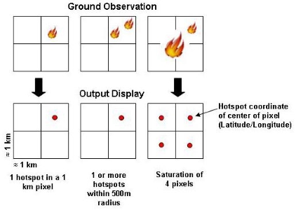
Hotspot Data
Hotspots are produced from thermal (heat) sensors on a number of different satellites. They are usually accurate to within 1km of their actual location. Due to the way the heat image is converted into hot spot points, one large fire could show up as many hotspots or a number of smaller fires could appear as one hotspot. Sometimes smaller fires do not produce a hotspot and other times hotspots may appear where there are no fires. Cloud cover also affects the satellites ability to capture hotspots. So, hotspots are often a useful guide, but do not always tell the whole truth. Burnt Area Maps
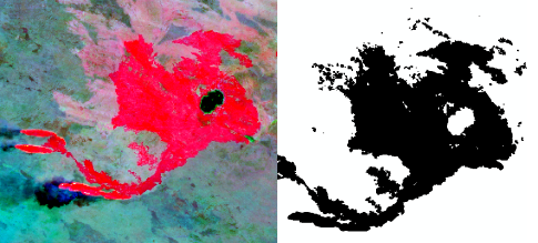
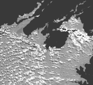
Burnt area maps use a satellite image, and identify (classify) only the areas that have been burnt. The example above shows a burnt area (fire scar) in
red on a Landsat image and the same burnt area mapped, with burnt shown as black and not burnt shown as white.
! Remember the potential frequency and detail of burnt area maps are determined by the characteristics of the satellite sensor being used. Checking out Burnt Areas Direct from the Satellite Image
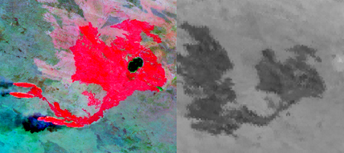
Sometimes you may just wish to have a quick look at the progress of a fire without needing someone to map them first. There are a number of ways you can access satellite imagery directly and produce quick look images. One way is through a service such as Landsat Live that displays the latest Landsat Data. You can also download a full image for viewing in free desktop GIS software such as SAGA GIS. This can be useful if you want to view the latest MODIS imagery showing daily fire scars, or quickly view your aerial burning to assess outcomes. For example the Landsat imagery on the top right gives a detailed picture of the burnt area but it is a few days old. Also note the smoke coming from the western edge of the fire scar indicating it is still active. To see the most up-to-date burnt area extent you can directly access MODIS imagery. In this bottom right example we can see the fire has continued to burn a much larger area. The Trouble With Cloud
Cloud cover prevents satellite sensors from capturing information on the ground and is a constant issue for providing comprehensive burnt area and hotspot coverage.
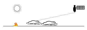
As shown above, it may be clear above the fire but if the satellite's orbit is low in the sky, clouds low on the horizon can block detection. |